Narrow Sidebar
Narrow-sidebars are components that let users navigate within the content of a product. It must be displayed fixed on the left side of the screen and can't be expanded. This component should be used only in a situation where there is a small amount of content
Overview
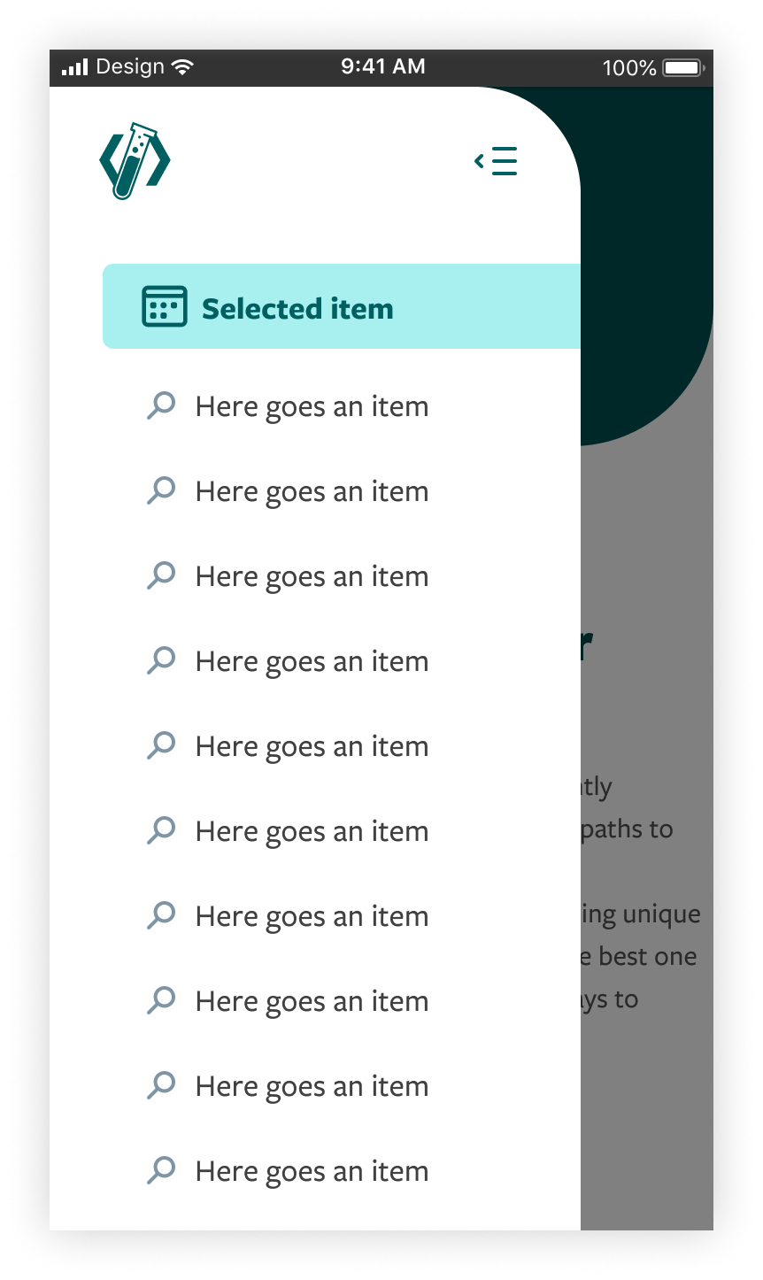
The Narrow Sidebar is divided into three parts.
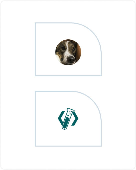
First, we have the header area. You may use the header to add your logo or user avatar.
Below the header is the body, which should be top aligned. It can have up to 6 items without scrolling. If more items are necessary, this container will probably have a scrolling behavior.
Last, the bottom area should be used as a footer utility content. This container can have action buttons or additional secondary information/links. Here, the content will vary according to the application needs.
Header (mandatory)
You must choose at least one of the above options to use in your Narrow Sidebar.
*Even if using body or footer is optional, the narrow sidebar should have at least one of them.
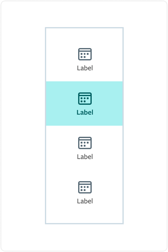
Body
The body can be designed following these components above. The labels can only have 15 characters, so if more text is necessary here, you should use the Standard Sidebar*.
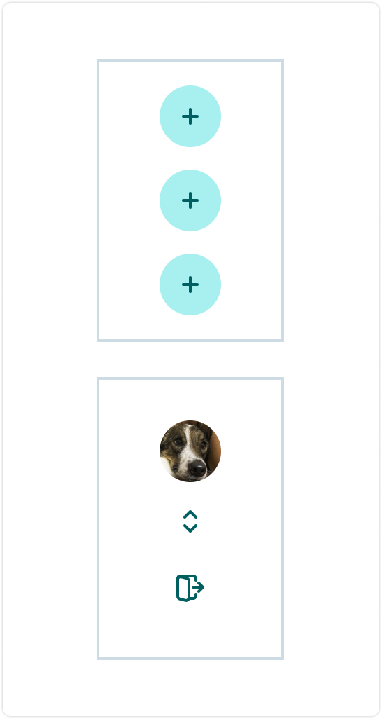
Footer
Using the footer is optional, and you can use one of the layouts above.
Interactive demo
This demo lets you preview the component, its variations, and configuration options. Not all props are available as controls, for more information check the Prop API below

Body
Footer
Prop API
Go to Setup for instructions on how to import the component.
NarrowSidebar
| Name | Description | Default |
|---|---|---|
| children* | Components that will be rendered in the NarrowSidebar (Header, Item, Logotype, etc). node | - |
| isOpenOnMobile | In mobile environment, defines if the Sidebar is open. bool | false |
| isVivid | Defines if the rendered Sidebar has a vivid style. bool | false |
| withDividers | Defines if the Sidebar has dividers. bool | false |
Header
| Name | Description | Default |
|---|---|---|
| children | Components that will be rendered in the Header. node | - |
Body
| Name | Description | Default |
|---|---|---|
| children | Components that will be rendered in the Body. node | - |
Item
| Name | Description | Default |
|---|---|---|
| label* | This is the item's label. string | - |
| icon | Sets the icon related to the Item label. Default state: no icon. string | - |
| onClick* | Callback action to be executed when the Item is clicked. func | - |
| isActive | Defines if the current Item is the active one in the Sidebar. bool | false |
Footer
| Name | Description | Default |
|---|---|---|
| children | Components that will be rendered in the Footer. node | - |
FooterButton
| Name | Description | Default |
|---|---|---|
| label* | This is the button label. string | - |
| icon | Sets the icon related to the button label. Default state: no icon. string | - |
| onClick* | Callback action to be executed when the FooterButton is clicked. func | - |
UserAvatar
| Name | Description | Default |
|---|---|---|
| avatarSrc* | Source of the avatar to be rendered. string | - |
| altText* | Text that will specify the HTML alt attribute of an string | - |
| caption* | Text that will be rendered as the avatar's caption. string | - |
Logotype
| Name | Description | Default |
|---|---|---|
| logoSrc* | Source of the logo to be rendered. string | - |
| altText* | Text that will specify the HTML alt attribute of an string | - |
CollapseButton
| Name | Description | Default |
|---|---|---|
| onClick* | Callback action to be executed when the CollapseButton is clicked. func | - |
Accessibility
Tab order
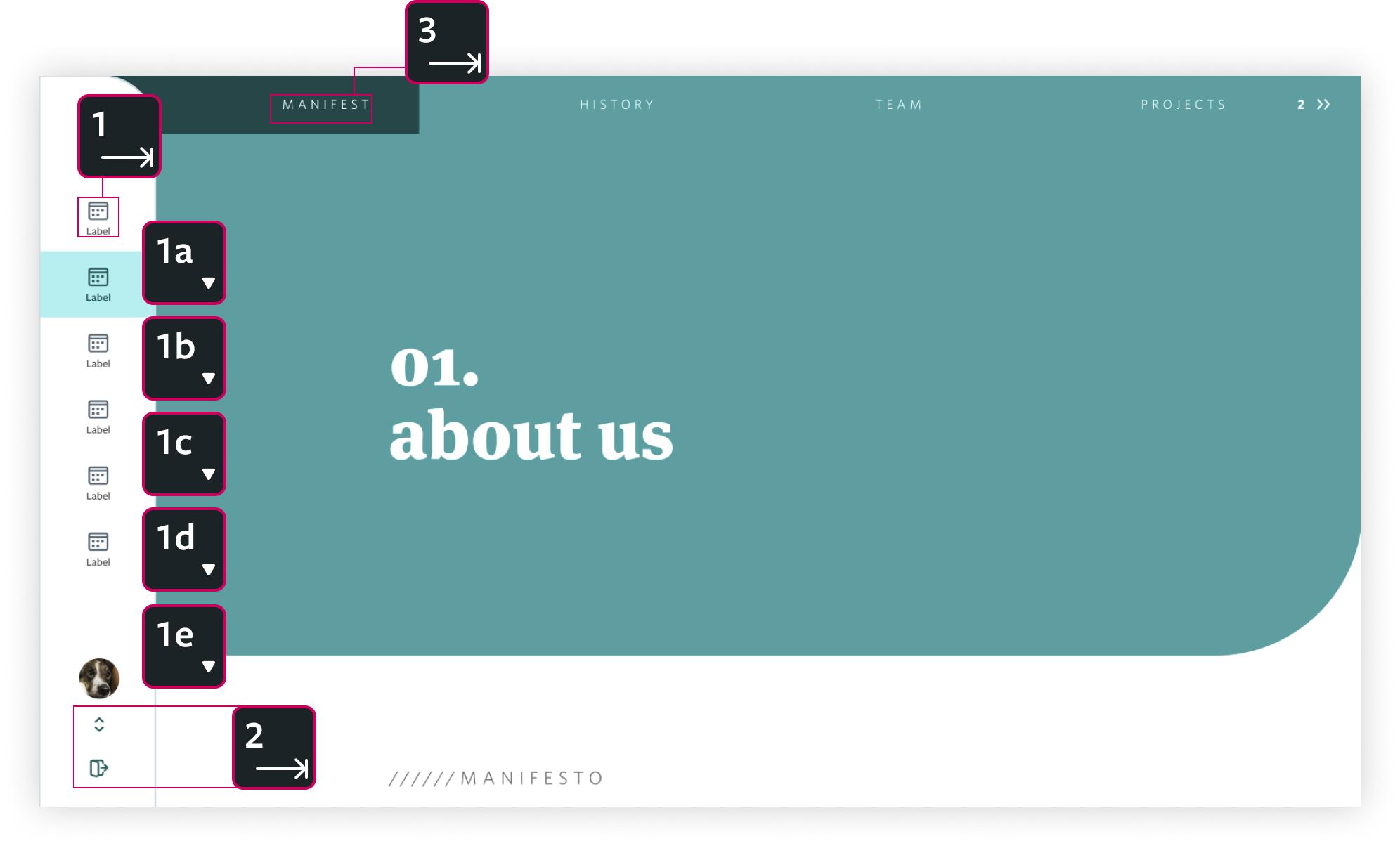
The tab navigation should start being withheld by the Narrow Sidebar.
After focusing on the first element, the navigation should happen with the use of the keyboard arrows. If the user presses the tab again, the focus goes to the footer area. The third tab should focus on the main content region, going out of the Narrow Sidebar.
Size and Responsiveness
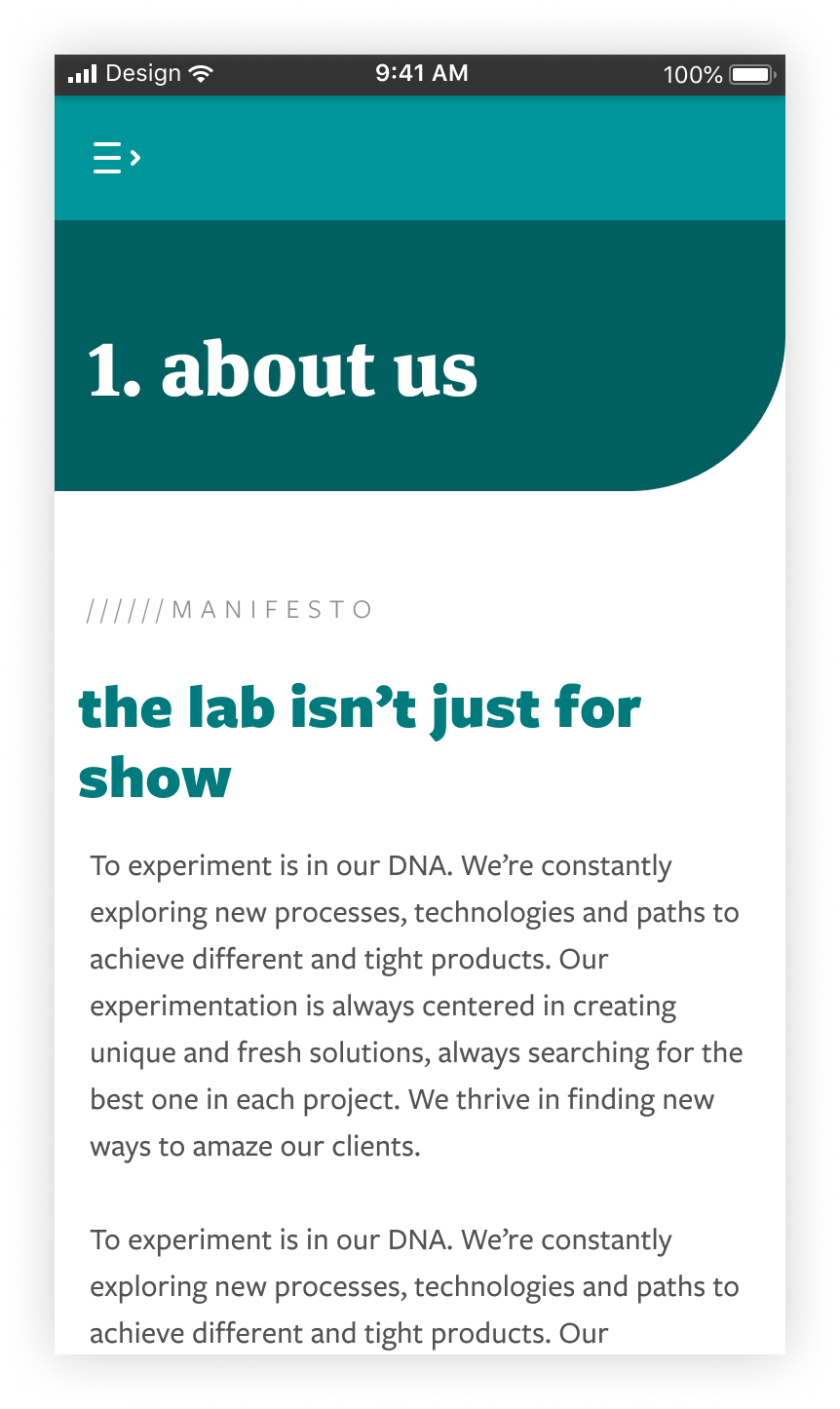
On mobile, the Narrow Sidebar must have 80% of the screen width and cannot collapse. The height should be 100% of the viewport. What happens in mobile is that the component stays hidden and appears if the user triggers the action to open it.
When the sidebar is hidden, there is a topbar component where the open navigation icon button should be. Clicking this button opens the navigation.
When the sidebar is open, it looks almost like mobile Standard Sidebar*, with the difference that the body only can have items, with no multilevel sections.
Behavior
Desktop
The Narrow Sidebar must always be fixed at the left side of the screen. As this component is not expandable, it does not have any animation, besides the ones that are already defined by the body's items states.
Mobile
Mobile Narrow Sidebar has an animation to hide and reveal the component. When the topbar button is trigerred, the side navigation stays temporary visible and slides over the content. The Narrow Sidebar disappears again if user clicks on the header "collapse button" or if he clicks outside the component.
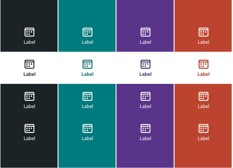
Theming
The default theme for the Narrow Sidebar is teal. You can change it in the scss/variables/_settings.scss file. Available colors are Teal, Purple, Mineral and Coral.
All colors, except Coral, have two skins: pale and vivid. Coral is only allowed on vivid skin. Background and border colors change according to the descriptions below.
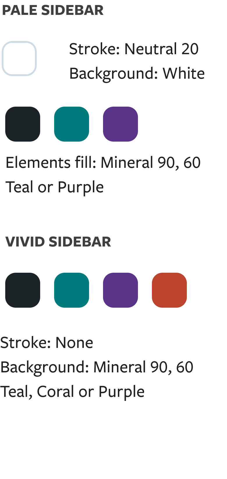 | 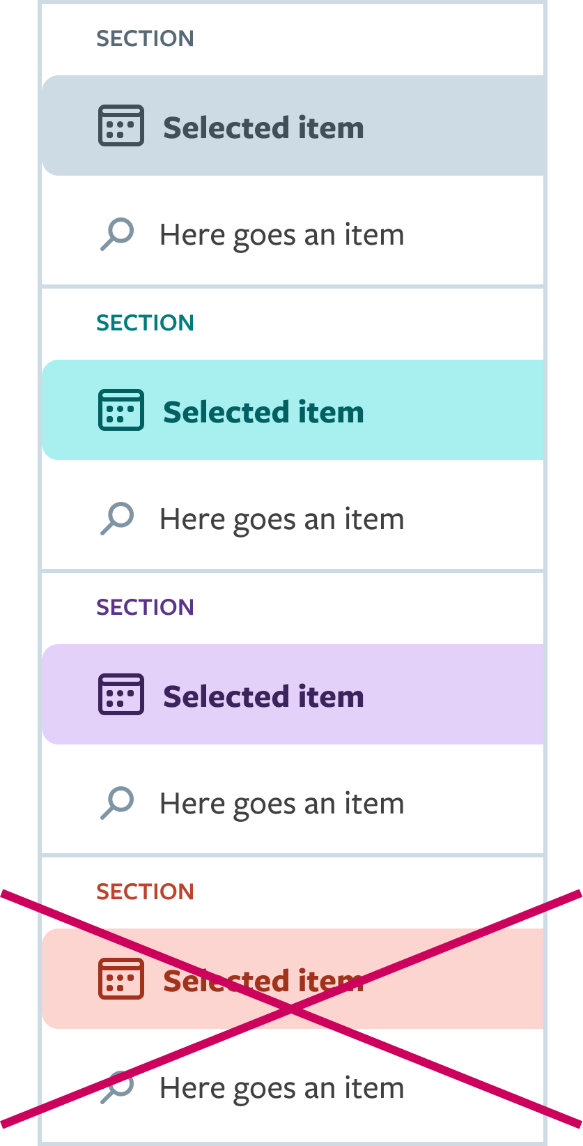 |
Coral shades cannot be used for elements on pale sidebar.
Vivid sidebars' buttons follow the exceptions guidelines (as seen at the page Button)
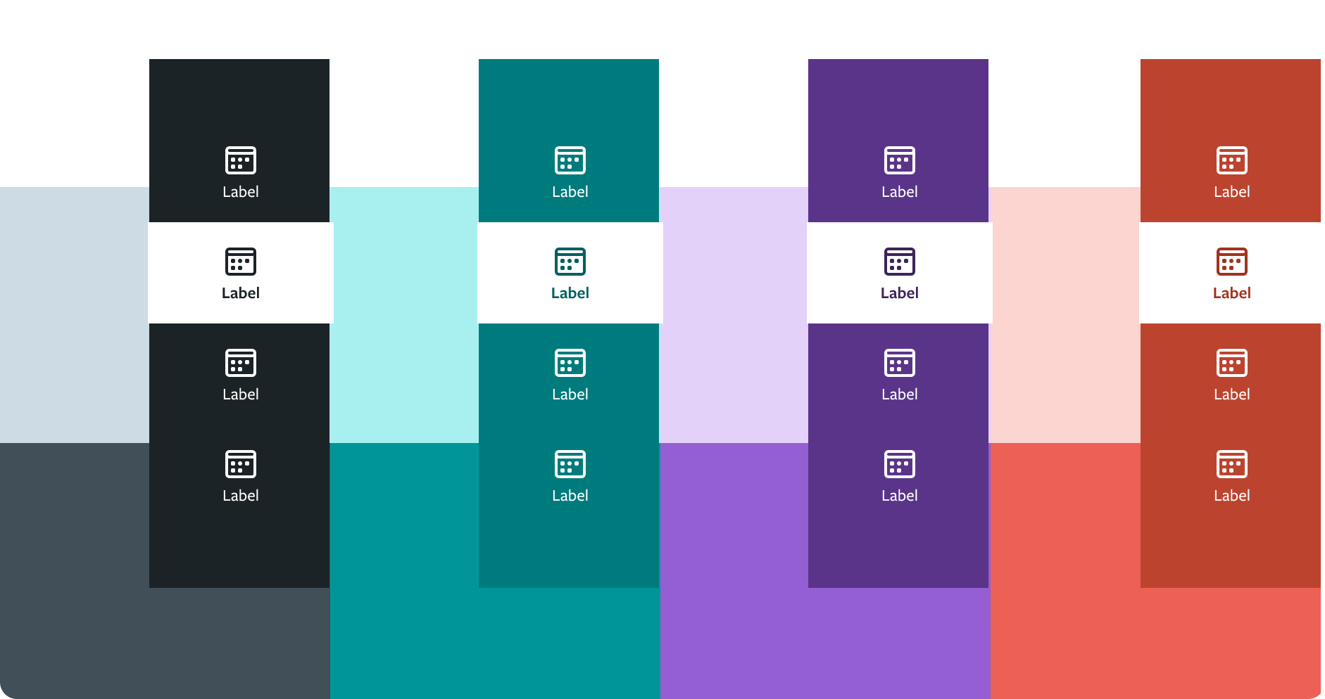
Color Combination
Pale narrow sidebar may be used over any page background color, but the elements should consider the UI theme (if the app uses a teal theme, it must use the elements following this color scheme). For vivid narrow sidebar, make sure to have at least a difference of 20 between sidebar and page's background color values.
Pale Sidebar
Default Narrow Sidebar has Pale Skin that has three different colors option - teal, purple and mineral. What defines what color must be chosen is the application theme.
Vivid Sidebar
Default narrow sidebar vivid skin that has four different colors option - teal, purple, coral and mineral. What defines what color must be chosen is the application theme.