Search
Overview
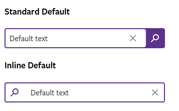
The search component should be used for searching contents within a website or an app. We can have 2 types of search components: Standard and Inline.
Field elements
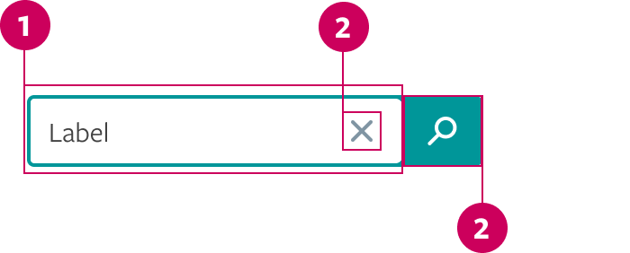
- Text input
- Clear Button
- Search Button area
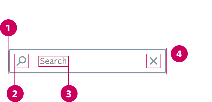
- Search input container
- Search trigger
- Label
- Clear button
Standard Search
It's a standard input linked to a search button. It should be used when the design needs more emphasis in the search funcionality. This search suggests results in an autocomplete dropdown and, for more detailed answers, it can take the user to another page.
Inline Search
Similar to the text with trailing icon input. It should be used when the design needs a more compact and clean component. This search works filtering the results and showing them simultaneously as the user types.
Prop API
Go to Setup for instructions on how to import the component.
| Name | Description | Default |
|---|---|---|
| id | Text that will serve as unique identifier. It's also an important accessibility tool. string | - |
| defaultValue | Defines a default value for the Search initialization. string | - |
| ariaDisabled | Disables the Search. Will be read by screen readers. When true, will override disabled.bool | false |
| disabled | Disables the Search. Won't be read by screen readers. bool | false |
| value | Text that will be rendered inside the Search field. string | - |
| onChange | Action to be executed when the Search default value changes. func | () => {} |
| onSearch | Action to be executed when the search is performed. func | () => {} |
| onClear | Action to be executed when the Search is cleared out. func | () => {} |
| placeholder | The placeholder text when the Search field is empty. Usually used to describe the values accepted (e.g.: Search by keyword or status). string | "Search" |
Behavior
Standard Search
- If the page have the search funcionality as the main purpose, the seach field should be focused by default. If not, focus to activate it.
- With the field focused, type the query.
- "X" icon apears at the right corner of the text input, and it can be clicked at any moment to clear whatever was typed. Pressing the
ESCkey also clears the input value. - An autocomplete dropdown should appear under the search input.
- Click on the search button / press enter to trigger the search action or choose a result of the autocomplete dropdown and click on it.
- Click outside the component if you want to unfocus the input without triggering the search action, but keeping the typed text.
Inline Search
- Focus the inline seach field.
- Type the query.
- The results should appear as the keyword is typed and should behave as a filtered search.
- Click on the "X" icon or press the
ESCkey to clear the input value. - Click outside the component if you want to unfocus the input.
Theming
For Search component, you can also use purple theme. The theme must be selected by changing the value of the $input-theme variable in the scss/variables/_settings.scss.