Toggle
Overview
Toggle is a selection control that allows the user to choose a single option at a time. It works as an on/off switch.
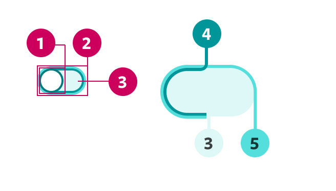
- Switcher
- Toggle border
- Toggle background
- Base container stroke
- Focus stroke
Demo
Prop API
Go to Setup for instructions on how to import the component.
| Name | Description | Default |
|---|---|---|
| id* | Text that will serve as unique identifier. It's also an important accessibility tool. string | - |
| name* | Text that will specify the HTML name attribute of an <input> element.string | - |
| value | Defines a static value for the Toggle. If set, internal logic is deactivated. bool | - |
| color | Defines the Toggle color. "teal""purple" | "teal" |
| ariaDisabled | Disables the Toggle. Will be read by screen readers. When true, will override disabled.bool | false |
| disabled | Disables the Toggle. Won't be read by screen readers. bool | false |
| defaultValue | Sets value to true by default. bool | - |
| handleToggle | Action executed when the Toggle is clicked. func | () => {} |
Theming
The toggle color is passwd via the color prop. Avoid using purple toggles if the project theme is teal, and vice versa.
Toggle Disabled
Toggle can be disabled and, at the same time receive, a defaultValue: