Tooltip
Overview
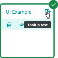
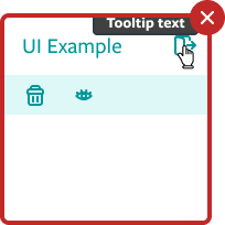
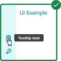
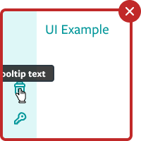
Tooltips display support text when users hover over, focus on, or tap an element.
Do
- Describes differences between similar elements
- Distinguishes actions with related iconography
- Provides advanced tips such as keyboard shortcuts
- Displays full information of ellipse texts
Don't
- Don’t use tooltips to restate visible UI text
- Don't use tooltips to display hidden actions
- Don’t display rich text and imagery on tooltips
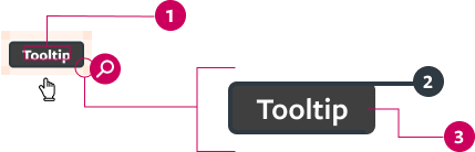
- Text
- Border (2px)
- Background
- No more than 12 words or 65 characters per line
- No more than 3 lines of text
Demo
Prop API
Go to Setup for instructions on how to import the component.
| Name | Description | Default |
|---|---|---|
| id* | Text that will serve as unique identifier. It's also an important accessibility tool. string | - |
| text* | Text that will be rendered inside the Tooltip. string | - |
| placement | Defines the Tooltip's relative position from the target. "top-start""top""top-end""right-start""right""right-end""bottom-start""left-start" | "top" |
| children* | Target component to which the Tooltip should be applied upon. node | - |
Behavior
On desktop, a tooltip is displayed upon hovering over it. It is not displayed on mobile. Continuously display the tooltip as long as the user hovers over the element.
- By default the tooltip appears above and in the center of click targets* and stays in place while the cursor moves within the target
- Tooltip disappears when the cursor moves out of the target
- Tooltip remains while the cursor moves within the target
- On sidebars, it should display either from the left or the right of click targets
- Over 150ms, tooltips fade in and scale up using the deceleration curve. They fade out over 75ms.
* When close to screen limits, keep tooltip position visible with margins of 12px for all sides.
Theming
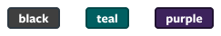
The tooltips color is defined in the scss/variables/_settings.scss file, and can be Black, Teal or Purple. Avoid using Purple tooltips if the project theme is Teal, and vice versa.
Special Guidelines
Placement
Tooltips placement relative to the target is defined by the user through props, and can have one of the 12 following values. The default value is top.
Long texts
Tooltip text should not be longer than 180 characters and 3 lines. A warn will be thrown in the console if the 180 chars limit is crossed.
Icon
Tooltip can also be triggered by an Icon or other elements.